1 Design principle
在谈论四个设计的基本准则前, 作者强调了关于命名的重要性.
作者举了一个例子, 在圣诞节, 他收到一本书介绍树木的分类, 他注意到一种叫Joshua tree的树, 造型奇特. 他想, 如果我看过, 我肯定会记得, 毕竟形状特别. 当他走出家门时, 发现社区80%的院子都有这种树, 但他此前从未注意到. 一旦你可以叫出它的名字, 你就发现它随处可见
Once you can name something, you’re conscious of it. You have power over it. You’re in control. You own it.
深有体会. 树尤如此, 设计准则亦如是.
Good design is as easy as:
- Learn the basic principles: They’re simpler than you might think
- Recognize when you’re not using them: Put it into words - name the problem
- Apply the principles: Be amazed
1.1 Proximity
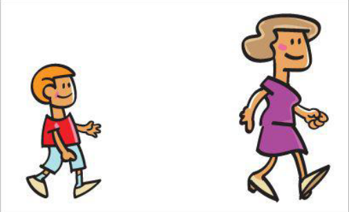
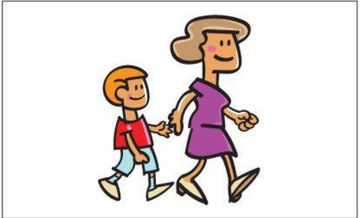
The principle of Proximity states: Group related item together. 有关联的元素, 位置上让它们更接近, 以表示它们有关联的一个群组而不是若干个无关联散落的元素
当然, 有关联才放在一起, 没关联就不要硬挤过来. 留下视觉距离让读者可以判别出他们的关系. 这也和生活经验吻合, 可以从两人的物理距离判别出他们的关系
如下例子:
The idea of proximity doesn’t mean that everything is closer together; it means elements that are ntellectually connected, those that have some sort of communication relationship, should also be visually connected.
It’s all about space. The principle of Proximity helps you focus on space and what it can do for communication
1.2 Alignment
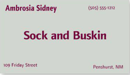
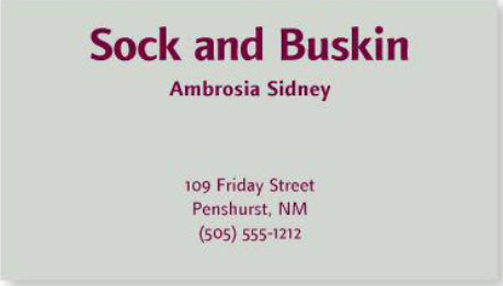
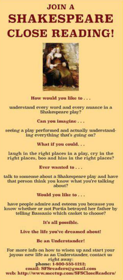
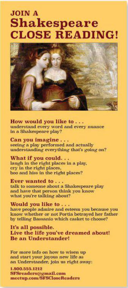
The Principle of Alighment states: Nothing should be placed on the page arbitrarily. Every item should have a visual connection with something else on the page. The principle of alignment forces you to be conscious – no longer can you just throw things on the page and see where they stick
通过对齐, 可以让元素之间产生联系, 使杂乱的设计变得有条理, 通过布局来展现关联. 如下图分析
又或者是:
通常来说, 左对齐或者右对齐会比居中对齐有更强烈的视觉效果, 因为居中对齐两边不对齐, 就会让我有种未对齐的感觉
对于页面, 可分析其页面元素的对齐, 然后修正成统一的对齐方式. 而下图的书页, 左右都对齐了, 还增加了缩进和行分隔, 看起来就清晰多了.
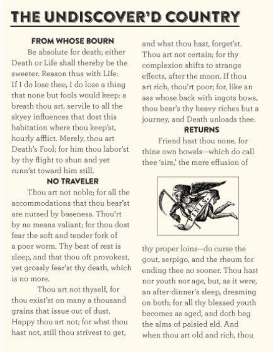
I am giving you a number of rules here, and it’s true that rules are made to be broken. But remember the Rule about Breaking Rules: You must know what the rule is before you can break it
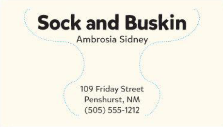
1.3 Repetition
The Principle of Pepetition States: Repeat some aspect of the design throught the entire piece. The repetitive element may be a bold font, a thick rule(line), a certain bullet, design element, color, format, spatial relationships, etc. It can be anything that a reader will visually recognize
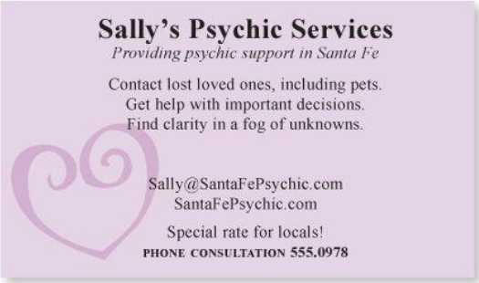
重复是一致性的一种实现, 但重复并不止于一致性, 它还是一种统一设计中各个元素的有力手段. 还是熟悉的名片:
1.4 Contrast
The Principle of Contrast states: Contrast Various elements of the piece to draw a reader’s eye itno the page. If two items are not exactly the same, then make them different. Really different
对比有很多手法, 诸如大与小, 复古与新潮, 强与弱, 明与暗, 粗糙与细滑, 水平与垂直等等.
需要注意的是, 如果两个元素有区分, 但本质无差别, 那就不是 contrast, 而是 conflict.
There is one more general guiding principle of Design(and of Life): Don’t be wimp
突然意识到, 本书的PDF 版本的排版和字段, 图片也是相当舒服的
2 Design with Type
接下来大部分内容都关于Type, 关于印刷, 关于字体种类, 不是很感兴趣, 所以就草草涉猎过.
 公号同步更新,欢迎关注👻